15 弹出选项与切换状态
1. 选择木鱼界面分析
现在想要的效果如下所示,点击第二个绿色按钮时,从底部弹出木鱼图片的选项。从界面上来说,有如下几个要点:
- 需要展示木鱼样式的基本信息,包括名称、图片及每次功德数范围。
- 需要将当前展示选择的木鱼边上蓝色边线,表示选择状态。
- 选择切换木鱼时,同时更新主界面木鱼样式。
| 木鱼界面 | 选择界面 |
|---|---|
| 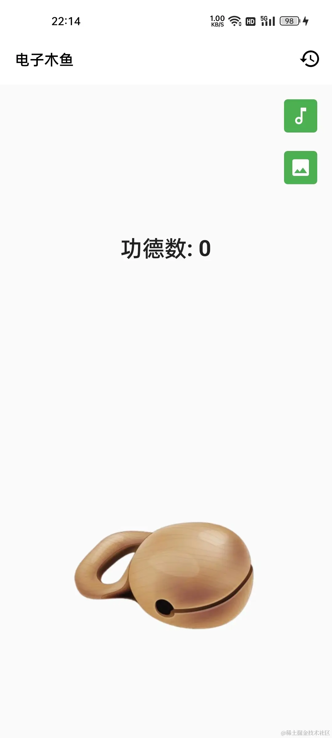 | 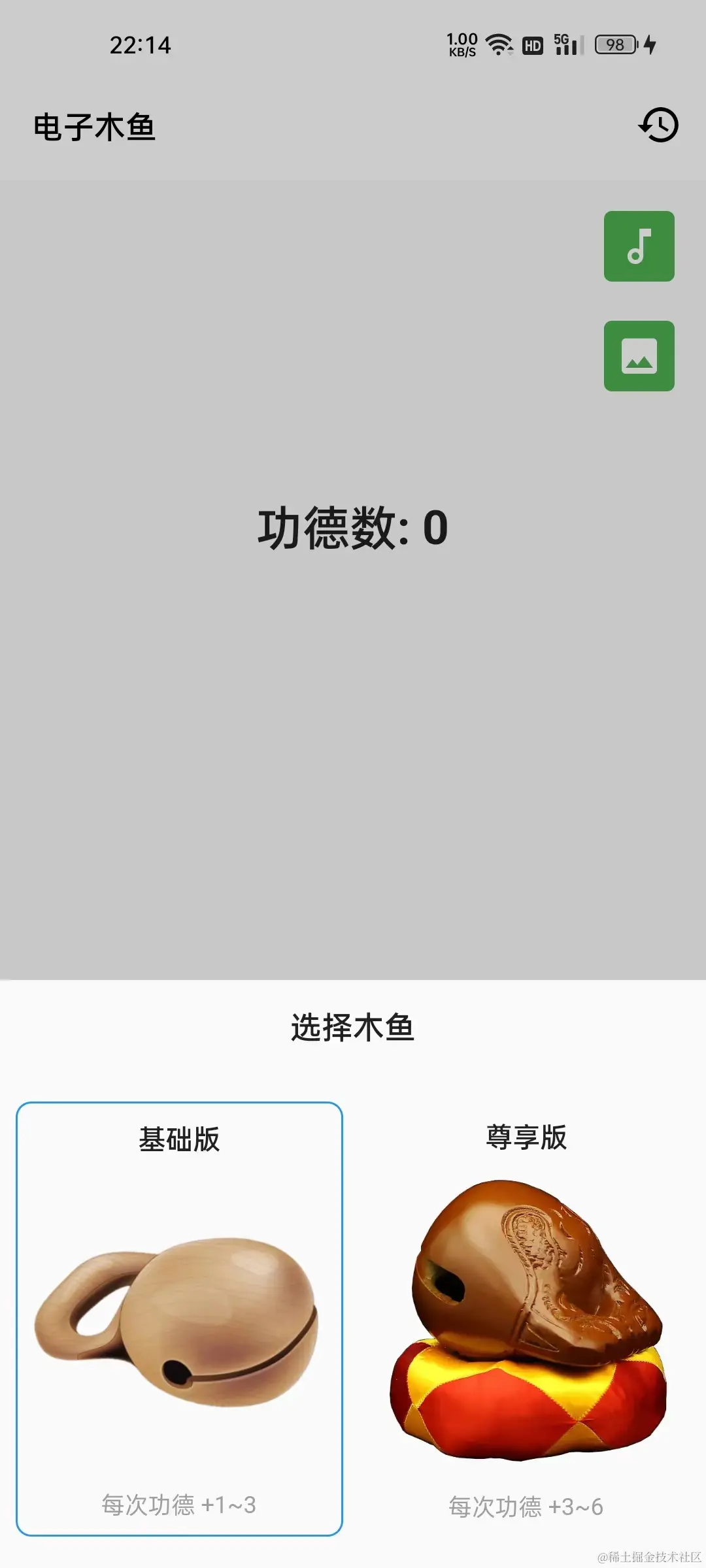 |
仔细分析可以看出,两个选项的布局结构是类似的,不同点在于木鱼的信息以及激活状态。所以只要封装一个组件,就可以用来构建上面的两个选择项,这就是封装的可复用性。不过在此之前先梳理一下木鱼的数据信息: 根据目前的需求设定,木鱼需要 名称、图片资源、增加功德范围 的数据,这些数据可以通过一个类型进行维护,比如下面的 ImageOption 类:
--->[muyu/models/image_option.dart]---
class ImageOption{
  final String name; // 名称
  final String src; // 资源
  final int min; // 每次点击时功德最小值
  final int max; // 每次点击时功德最大值

  const ImageOption(this.name, this.src, this.min, this.max);
}
对于一个样式来说,依赖的数据是 ImageOption 对象和 bool 类型的激活状态。这里封装一个 ImageOptionItem 组件用于构建一种样式的界面:
代码如下,红框中的单体是上中下的结果,通过 Column 组件竖向排列,另外使用装饰属性的 border ,根据是否激活,添加边线。其中的文字、图片数据都是通过 ImageOption 类型的成员确定的。
--->[muyu/options/select_image.dart]---
class ImageOptionItem extends StatelessWidget {
  final ImageOption option;
  final bool active;

  const ImageOptionItem({
    Key? key,
    required this.option,
    required this.active,
  }) : super(key: key);

  @override
  Widget build(BuildContext context) {
    const Border activeBorder = Border.fromBorderSide(BorderSide(color: Colors.blue));
    return Container(
      padding: const EdgeInsets.symmetric(vertical: 8),
      decoration: BoxDecoration(
        borderRadius: BorderRadius.circular(8),
        border: !active ? null : activeBorder,
      ),
      child: Column(
        children: [
          Text(option.name, style: TextStyle(fontWeight: FontWeight.bold)),
          Expanded(
            child: Padding(
              padding: const EdgeInsets.symmetric(horizontal: 8.0),
              child: Image.asset(option.src),
            ),
          ),
          Text('每次功德 +${option.min}~${option.max}',
              style: const TextStyle(color: Colors.grey,fontSize: 12)),
        ],
      ),
    );
  }
}
2.底部弹框及界面构建
由于有了新需求,_MuyuPageState 状态类需要添加一些状态数据来实现功能。如下,新增了 imageOptions 对象表示木鱼选项的列表;已及 _activeImageIndex 表示当前激活的木鱼索引:
---->[_MuyuPageState]----
final List<ImageOption> imageOptions = const [
  ImageOption('基础版','assets/images/muyu.png',1,3),
  ImageOption('尊享版','assets/images/muyu_2.png',3,6),
];

int _activeImageIndex = 0;
点击时的底部弹框,可以使用 showCupertinoModalPopup 方法实现。其中 builder 入参中返回底部弹框中的内容组件,这里通过自定义的 ImageOptionPanel 组件来完成弹框内界面的构建逻辑。
---->[_MuyuPageState]----
void _onTapSwitchImage() {
  showCupertinoModalPopup(
    context: context,
    builder: (BuildContext context) {
      return ImageOptionPanel(
        imageOptions: imageOptions,
        activeIndex: _activeImageIndex,
        onSelect: _onSelectImage,
      );
    },
  );
}
很容易可以看出选择木鱼的面板中需要 ImageOption 列表、当前激活索引两个数据;由于点击选择时需要更新主界面的数据,所以这里通过 onSelect 回调,让处理逻辑交由使用者来实现。
--->[muyu/options/select_image.dart]---
class ImageOptionPanel extends StatelessWidget {
  final List<ImageOption> imageOptions;
  final ValueChanged<int> onSelect;
  final int activeIndex;

  const ImageOptionPanel({
    Key? key,
    required this.imageOptions,
    required this.activeIndex,
    required this.onSelect,
  }) : super(key: key);
界面的构建逻辑如下,整体结构并不复杂。主要是上下结构,上面是标题,下面是选项的条目。由于这里只要两个条目,使用 Row + Expanded 组件,让单体平分水平空间:
@override
Widget build(BuildContext context) {
  const TextStyle labelStyle = TextStyle(fontSize: 16, fontWeight: FontWeight.bold);
  const EdgeInsets padding = EdgeInsets.symmetric(horizontal: 8.0, vertical: 16);
  return Material(
    child: SizedBox(
      height: 300,
      child: Column(
        children: [
          Container(
              height: 46,
              alignment: Alignment.center,
              child: const Text( "选择木鱼", style: labelStyle)),
          Expanded(
              child: Padding(
            padding: padding,
            child: Row(
              children: [
                Expanded(child: _buildByIndex(0)),
                const SizedBox(width: 10),
                Expanded(child: _buildByIndex(1)),
              ],
            ),
          ))
        ],
      ),
    ),
  );
}
在 _buildByIndex 中,简单封装一下根据索引生成条目组件的逻辑,并通过点击事件,触发 onSelect 回调,将条目对应的索引传递出去。
Widget _buildByIndex(int index) {
  bool active = index == activeIndex;
  return GestureDetector(
    onTap: () => onSelect(index),
    child: ImageOptionItem(
      option: imageOptions[index],
      active: active,
    ),
  );
}
到这里,万事俱备只欠东风,在点击木鱼样式回调中,需要更新 _activeImageIndex 的值即可,这里如果点击的是当前样式,则不进行更新操作。另外,在选择时通过 Navigator.of(context).pop() 可以关闭底部弹框。
---->[_MuyuPageState]----
void _onSelectImage(int value) {
  Navigator.of(context).pop();
  if(value == _activeImageIndex) return;
  setState(() {
    _activeImageIndex = value;
  });
}
最后,主页面中的图片和点击时增加的值需要根据 _activeImageIndex 来确定。这里在 _MuyuPageState 中给两个 get 方法,方便通过 _activeImageIndex 和 imageOptions 获取需要的信息:
---->[_MuyuPageState]----
// 激活图像
String get activeImage => imageOptions[_activeImageIndex].src;

// 敲击是增加值
int get knockValue {
  int min = imageOptions[_activeImageIndex].min;
  int max = imageOptions[_activeImageIndex].max;
  return min + _random.nextInt(max+1 - min);
}


//...
MuyuAssetsImage(
  image: activeImage, // 使用激活图像
  onTap: _onKnock,
),

void _onKnock() {
  pool?.start();
  setState(() {
    _cruValue = knockValue; // 使用激活木鱼的值
    _counter += _cruValue;
  });
}
这样,就可以选择木鱼样式的功能,在敲击时每次功德的增加量也会不同。如下右图中,尊享版木鱼每次敲击,数字增加在 3~6 之间随机。当前代码位置 muyu
| 选择 | 切换后敲击 |
|---|---|
|  |  |
这里有个小问题,可以作为思考,这个问题将会在下一篇解决: 如上左图,在切换图片时,会看到
功德+2的动画,这是为什么呢? 有哪些方式可以解决这个问题。
3. 选择音效功能
选择音效的整体思路和上面类似,点击主界面右上角第一个按钮,从底部弹出选择界面,这里准备了三个音效以供选择。当前音效也会高亮显示,另外右侧有一个播放按钮可以试听:
| 主界面 | 选择音效界面 |
|---|---|
|  | 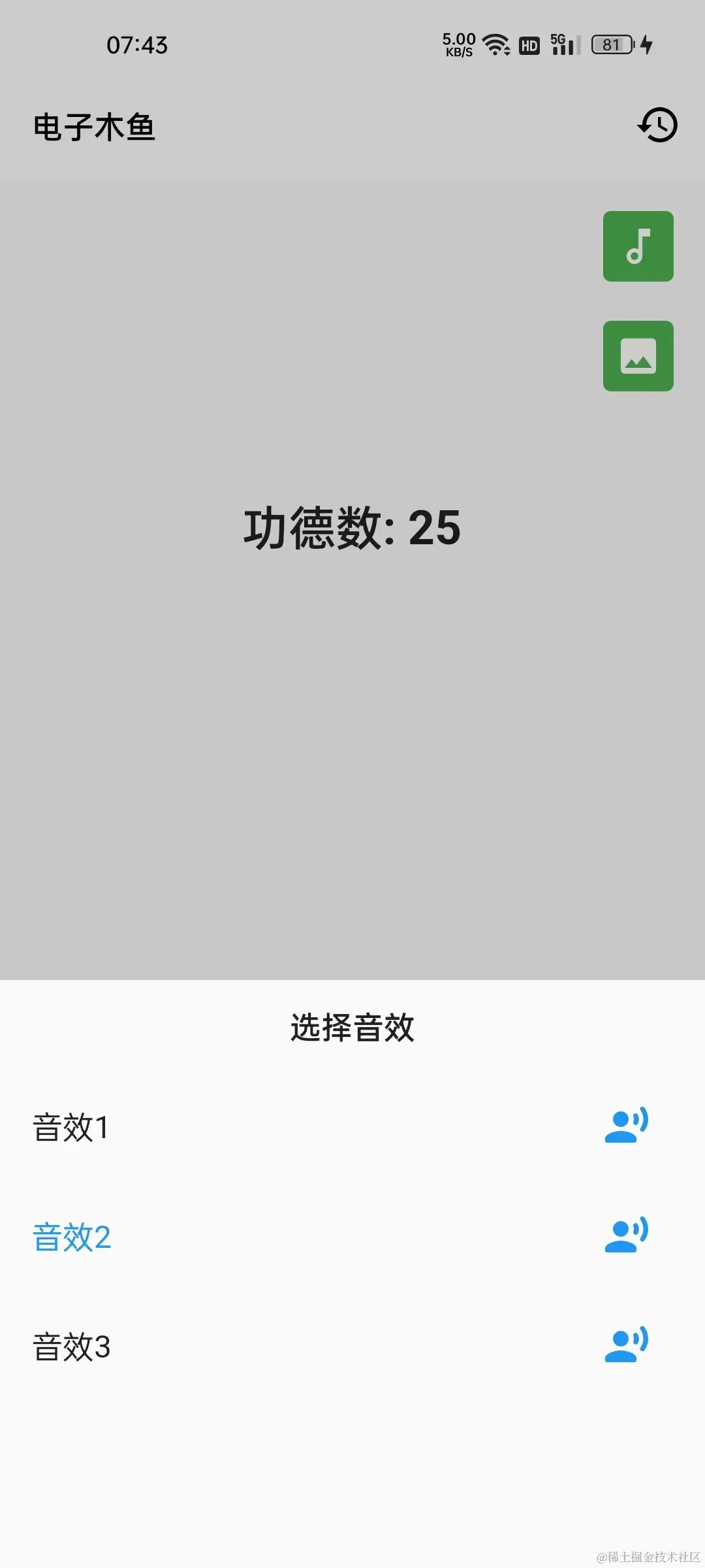 |
首先还是对数据进行一下封装,对于音频选择界面而言,两个信息数据: 名称 和 资源。这里通过 AudioOption 类进行
--->[muyu/models/audio_option.dart]---
class AudioOption{
  final String name;
  final String src;

  const AudioOption(this.name, this.src);
}
在 _MuyuPageState 中,通过 audioOptions 列表记录音频选项对应的数据;_activeAudioIndex 表示当前激活的音频索引:
---->[_MuyuPageState]----
final List<AudioOption> audioOptions = const [
  AudioOption('音效1', 'muyu_1.mp3'),
  AudioOption('音效2', 'muyu_2.mp3'),
  AudioOption('音效3', 'muyu_3.mp3'),
];

int _activeAudioIndex = 0;
如何同样,在点击按钮时,通过 showCupertinoModalPopup 弹出底部栏,使用 AudioOptionPanel 构建展示内容:
---->[_MuyuPageState]----
void _onTapSwitchAudio() {
  showCupertinoModalPopup(
    context: context,
    builder: (BuildContext context) {
      return AudioOptionPanel(
        audioOptions: audioOptions,
        activeIndex: _activeAudioIndex,
        onSelect: _onSelectAudio,
      );
    },
  );
}
目前只有三个数据,这里通过 Column 竖直排放即可,如果你想支持更多的选项,可以使用滑动列表(下篇介绍)。 另外,对于条目而言,Flutter 提供了一些通用的结构,比如这里可以使用 ListTile 组件,来构建左中右的视图。
AudioOptionPanel 界面构建逻辑如下,其中提供 List.generate 构造函数生成条目组件列表;每个条目由 _buildByIndex 方法根据 index 索引进行构建;构建的内容使用 ListTile 根据 AudioOption 数据进行展示。
注: 这里 listA = [1,2,…listB] 表示在创建 listA 的过程中,将 listB 列表元素嵌入其中。
--->[muyu/options/select_audio.dart]---
class AudioOptionPanel extends StatelessWidget {
  final List<AudioOption> audioOptions;
  final ValueChanged<int> onSelect;
  final int activeIndex;

  const AudioOptionPanel({
    Key? key,
    required this.audioOptions,
    required this.activeIndex,
    required this.onSelect,
  }) : super(key: key);

  @override
  Widget build(BuildContext context) {
    const TextStyle labelStyle = TextStyle(fontSize: 16, fontWeight: FontWeight.bold);
    return Material(
      child: SizedBox(
        height: 300,
        child: Column(
          children: [
            Container(
                height: 46,
                alignment: Alignment.center,
                child: const Text("选择音效", style: labelStyle, )),
            ...List.generate(audioOptions.length, _buildByIndex)
          ],
        ),
      ),
    );
  }

  Widget _buildByIndex(int index) {
    bool active = index == activeIndex;
    return ListTile(
      selected: active,
      onTap: () => onSelect(index),
      title: Text(audioOptions[index].name),
      trailing: IconButton(
        splashRadius: 20,
        onPressed: ()=> _tempPlay(audioOptions[index].src),
        icon: const Icon(
          Icons.record_voice_over_rounded,
          color: Colors.blue,
        ),
      ),
    );
  }

  void _tempPlay(String src) async{
    AudioPool pool = await FlameAudio.createPool(src, maxPlayers: 1);
    pool.start();
  }
}
最后,在 _MuyuPageState 中,选择音频回调时,根据激活索引,更新 pool 对象即可。这样在点击时就可以播放对应的音效。
---->[_MuyuPageState]----
String get activeAudio => audioOptions[_activeAudioIndex].src;

void _onSelectAudio(int value) async{
  Navigator.of(context).pop();
  if (value == _activeAudioIndex) return;
  _activeAudioIndex = value;
  pool = await FlameAudio.createPool(
    activeAudio,
    maxPlayers: 1,
  );
}
4.本章小结
本章通过弹出框展示切换音效和木鱼样式,可以进一步理解数据和界面视图之间的关系:数据为界面提供内容信息、界面交互操作更改数据信息。
另外,两个选项的面板通过自定义组件进行封装隔离,面板在需要的数据通过构造函数传入、界面中的事件通过回调函数交由外界执行更新数据逻辑。也就是说,封装的 Widget 在意的是如何构建展示内容,专注于做一件事,与界面构建无关的任务,交由使用者处理。
到这里,本篇新增的两个功能就完成了,当前代码位置 muyu 。目前为止,木鱼项目的代码已经有一点点复杂了,大家可以结合源码,好好消化一下。下一篇将继续对木鱼项目进行功能拓展,并以此学习一下滑动列表。