21 白板画笔的参数设置
1. 线粗选择器
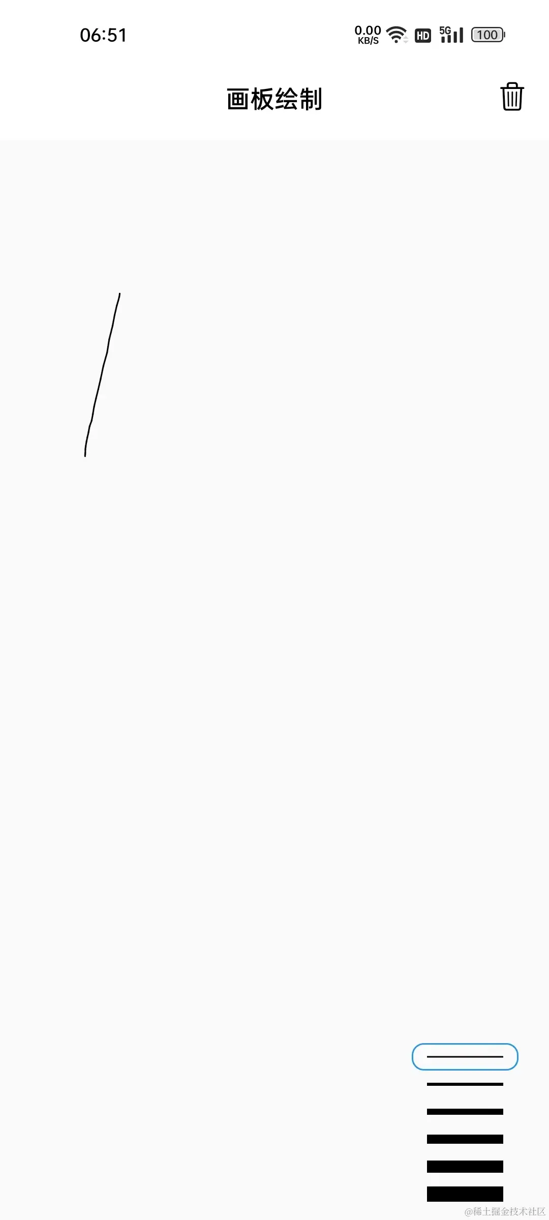
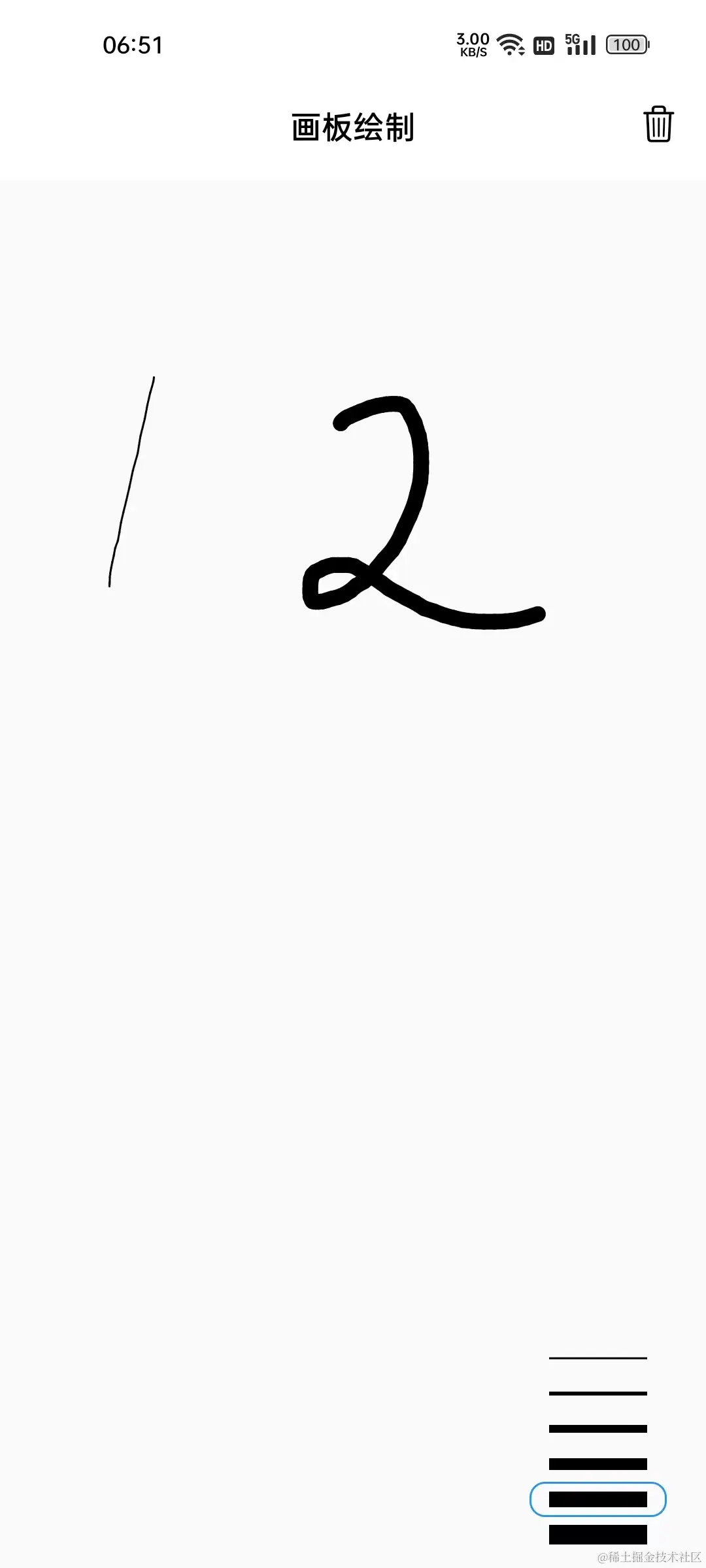
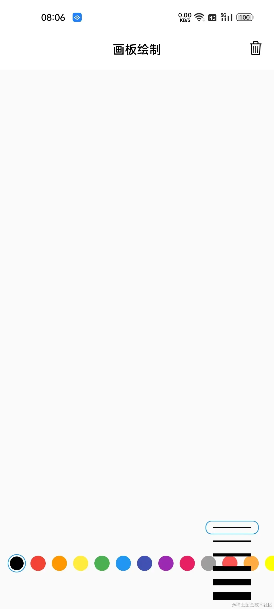
如下所示,左下角可以选择线的粗细,激活状态通过蓝色线框表示。在选择之后,激活状态发生变化,绘制时线的宽度也会变化。这个选择器的构建逻辑相对独立,以后也有复用的可能,可以单独抽离为一个组件维护,这里创建 StorkWidthSelector 组件,并将其通过 Stack 组件叠放在画板之上:
| 线粗 = 1 | 线粗 = 8 |
|---|---|
|  |  |
通过选择器在界面上的展示效果,不难看出组件需要依赖的数据有:
- 支持的线宽列表
List<double> - 激活索引
int - 条目的颜色
Color - 点击条目时的回调
ValueChanged<int>
类定义如下:
class StorkWidthSelector extends StatelessWidget {
  final List<double> supportStorkWidths;
  final int activeIndex;
  final Color color;
  final ValueChanged<int> onSelect;


  const StorkWidthSelector({
    Key? key,
    required this.supportStorkWidths,
    required this.activeIndex,
    required this.onSelect,
    required this.color,
  }) : super(key: key);
在组件构建逻辑中,主要是便历 supportStorkWidths 列表,通过 _buildByIndex 方法根据索引值构建条目。其中可以通过 index == activeIndex 来确定当前条目是否被激活;再通过激活状态确定是否添加边线:
@override
Widget build(BuildContext context) {
  return Padding(
    padding: const EdgeInsets.symmetric(horizontal: 8.0, vertical: 8),
    child: Column(
        crossAxisAlignment: CrossAxisAlignment.end,
        children: List.generate(
          supportStorkWidths.length,
          _buildByIndex,
        )),
  );
}

Widget _buildByIndex(int index) {
  bool select = index == activeIndex;
  return GestureDetector(
    onTap: () => onSelect(index),
    child: Container(
      margin: const EdgeInsets.symmetric(horizontal: 2),
      width: 70,
      height: 18,
      alignment: Alignment.center,
      decoration: BoxDecoration(
          borderRadius: BorderRadius.circular(8),
          border: select ? Border.all(color: Colors.blue) : null),
      child: Container(
        width: 50,
        color: color,
        height: supportStorkWidths[index],
      ),
    ),
  );
}
最后通过 Stack + Positioned 组件,将 StorkWidthSelector 组件叠放在界面的右下角;并通过 _onSelectStorkWidth 作为选择的回调处理界面状态数据的变化逻辑:
处理逻辑很简单,只要更新 _activeStorkWidthIndex 激活索引即可;另外在 _onPanStart 创建 Line 对象时,设置激活线宽即可:
void _onSelectStorkWidth(int index) {
  if (index != _activeStorkWidthIndex) {
    setState(() {
      _activeStorkWidthIndex = index;
    });
  }
}

void _onPanStart(DragStartDetails details) {
  _lines.add(Line(
    points: [details.localPosition],
    // 使用激活线宽
    strokeWidth: supportStorkWidths[_activeStorkWidthIndex],
  ));
}
到这里,就完成了线条宽度的选择功能,当前代码位置 paper 。
2. 颜色选择器
颜色选择器的原理也是一样,选择激活,在创建 Line 对象时设置颜色。只不过是条目的界面表现不同罢了,条目的构建逻辑也是通过 _buildByIndex 实现的。这里通过圆圈也表示颜色,点击时激活条目,激活状态由外圈的圆形边线进行表示:
| 标题 | |
|---|---|
| 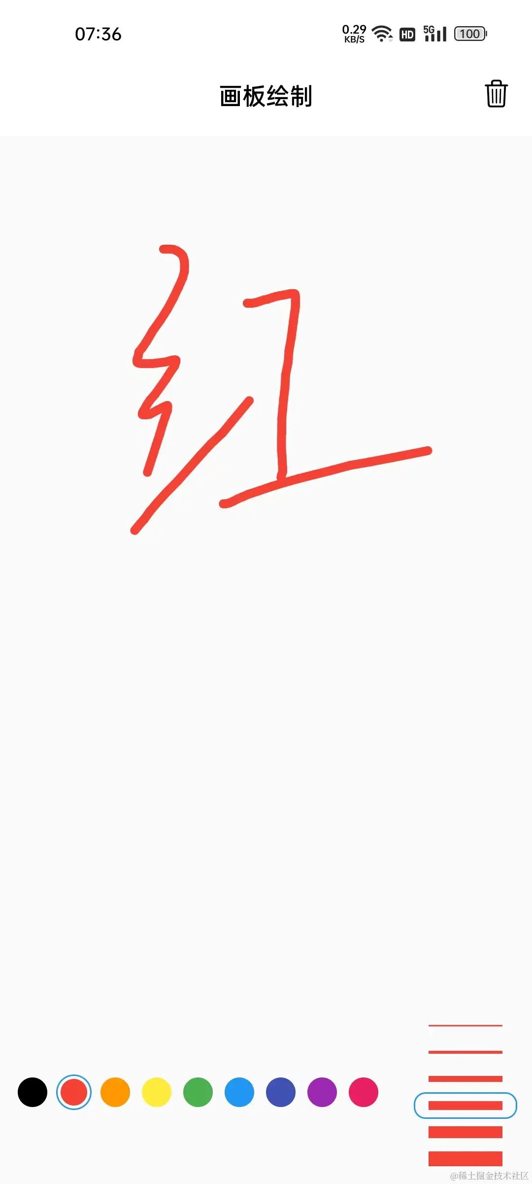 | 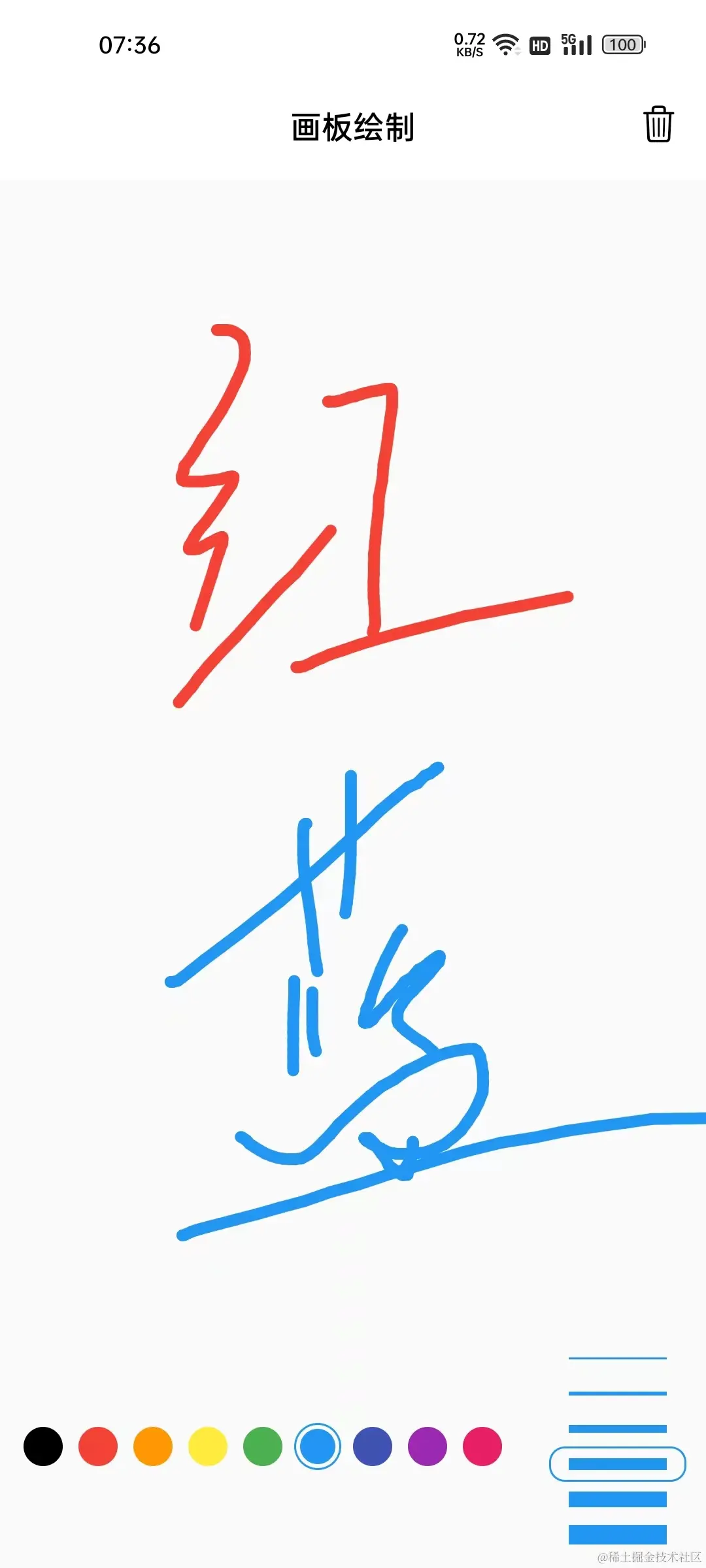 |
class ColorSelector extends StatelessWidget {
  final List<Color> supportColors;
  final ValueChanged<int> onSelect;
  final int activeIndex;

  const ColorSelector({
    Key? key,
    required this.supportColors,
    required this.activeIndex,
    required this.onSelect,
  }) : super(key: key);

  @override
  Widget build(BuildContext context) {
    return Padding(
      padding: const EdgeInsets.symmetric(horizontal: 8.0, vertical: 8),
      child: Wrap(
          // crossAxisAlignment: CrossAxisAlignment.end,
          children: List.generate(
            supportColors.length,
            _buildByIndex,
          )),
    );
  }

  Widget _buildByIndex(int index) {
    bool select = index == activeIndex;
    return GestureDetector(
      onTap: () => onSelect(index),
      child: Container(
        margin: const EdgeInsets.symmetric(horizontal: 2),
        padding: const EdgeInsets.all(2),
        width: 24,
        height: 24,
        alignment: Alignment.center,
        decoration: BoxDecoration(
          shape: BoxShape.circle,
            border: select ? Border.all(color: Colors.blue) : null
        ),
        child: Container(
          decoration: BoxDecoration(
              shape: BoxShape.circle,
            color: supportColors[index],
          ),
        ),
      ),
    );
  }
}
同理,在 _PaperState 中,颜色选择器也通过 Stack + Positioned 叠放在画板的左下角;点击回调时处理激活颜色索引数据的更新;以及创建 Line 对象时设置激活颜色:
void _onSelectColor(int index) {
  if (index != _activeColorIndex) {
    setState(() {
      _activeColorIndex = index;
    });
  }
}

void _onPanStart(DragStartDetails details) {
  _lines.add(Line(
    points: [details.localPosition],
    strokeWidth: supportStorkWidths[_activeStorkWidthIndex],
    color: supportColors[_activeColorIndex],
  ));
}
到这里,颜色选择和线宽选择功能就已经实现了,当前代码位置 paper 。但这里在布局上还有些问题,下面来分析处理一下。
3. 布局分析
这里通过 Positioned 将两块分别叠放在 Stack 的两侧,上面颜色少时没有什么问题。但如果颜色过多,可以发现这种方式的叠放会让后者把前者覆盖住
| 多颜色时 | 布局边界 |
|---|---|
|  |  |
在布局树中可以发现,默认情况下 Positioned 之下的约束为无限约束,也就是子组件想要多大都可以。所以子组件在竖直方向上没有约束,颜色太多时就会溢出的原因。
解决方案方案有很多,其中最简单的是指定 Positioned 组件的 width 参数,在水平方向施加紧约束。如下所示,可以限制 ColorSelector 的宽度等于 240。 ColorSelector 内部通过 Wrap 进行构建,在区域之内会自动换行:
Positioned(
  bottom: 40,
  width: 240,
  child: ColorSelector(
    supportColors: supportColors,
    activeIndex: _activeColorIndex,
    onSelect: _onSelectColor,
  ),
),
通过布局查看器可以看出,此时 ColorSelector 受到的约束宽度就固定在 240。
另外,我们还可以将 Positioned 提供的约束尺寸设为屏幕宽度,通过 Row 来水平排列,其中 ColorSelector 的宽度通过 Expanded 延展成剩余宽度。当前代码位置 paper
Positioned(
  bottom: 0,
  width: MediaQuery.of(context).size.width,
  child: Row(
    children: [
      Expanded(
        child: ColorSelector(
          supportColors: supportColors,
          activeIndex: _activeColorIndex,
          onSelect: _onSelectColor,
        ),
      ),
      StorkWidthSelector(
        supportStorkWidths: supportStorkWidths,
        color: supportColors[_activeColorIndex],
        activeIndex: _activeStorkWidthIndex,
        onSelect: _onSelectStorkWidth,
      ),
    ],
  ),
),
如果这里不提供 width ,而使用 Row + Expanded 组件的话,就会报错;根本原因是 Positioned 施加了无限约束,而 Row 使用了 Expanded 组件,延展无限的宽度区域是不被允许的:
通过这个小问题,带大家简单认识一下布局中约束的分析。很多布局上的问题,都可以从约束的角度解决。这里点到为止,如果对约束感兴趣,或有很多布局的困扰,可以研读一下我的布局小册: Flutter 布局探索 - 薪火相传
4. 本章小结
本章主要任务是完成白板画笔的参数设置,为用户提供修改颜色和线宽的操作,以便于绘制更复杂多彩的图案。从中可以体会出:新增加一个需求,往往会引入相关的数据来实现功能。比如对于修改颜色的需求,需要引入支持的颜色列表和激活的颜色索引两个数据。所以对于任何功能需求而言,不要只看其表面的界面呈现,更重要的是分析其背后的用户交互过程中的数据变化情况。
下一章,将继续对当前的画板项目进行一些小优化,比如支持回退和撤销回退的功能;以及优化一下点集的收集策略,来尽可能地避免收录过多无用点,减小绘制的压力。